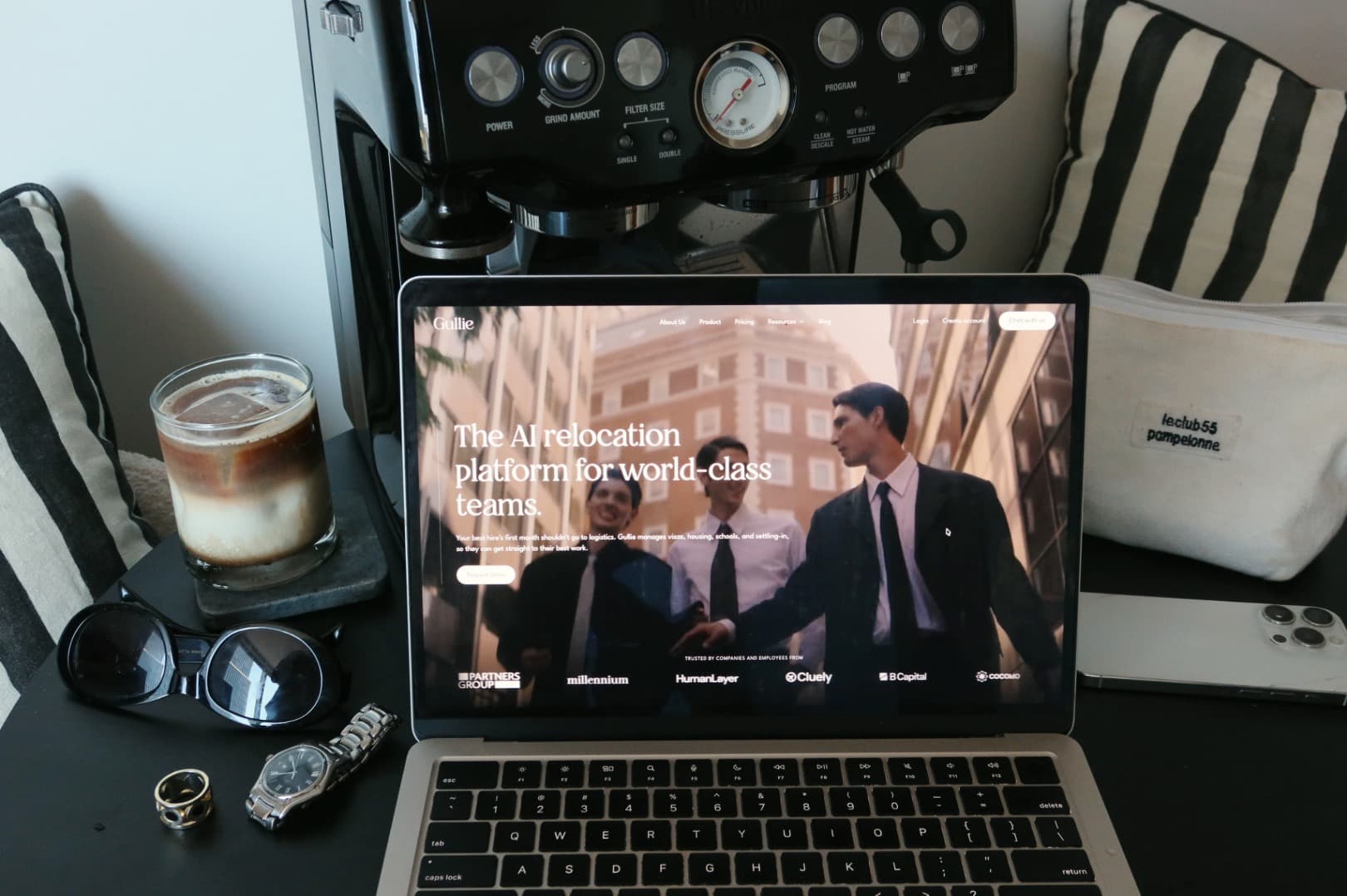
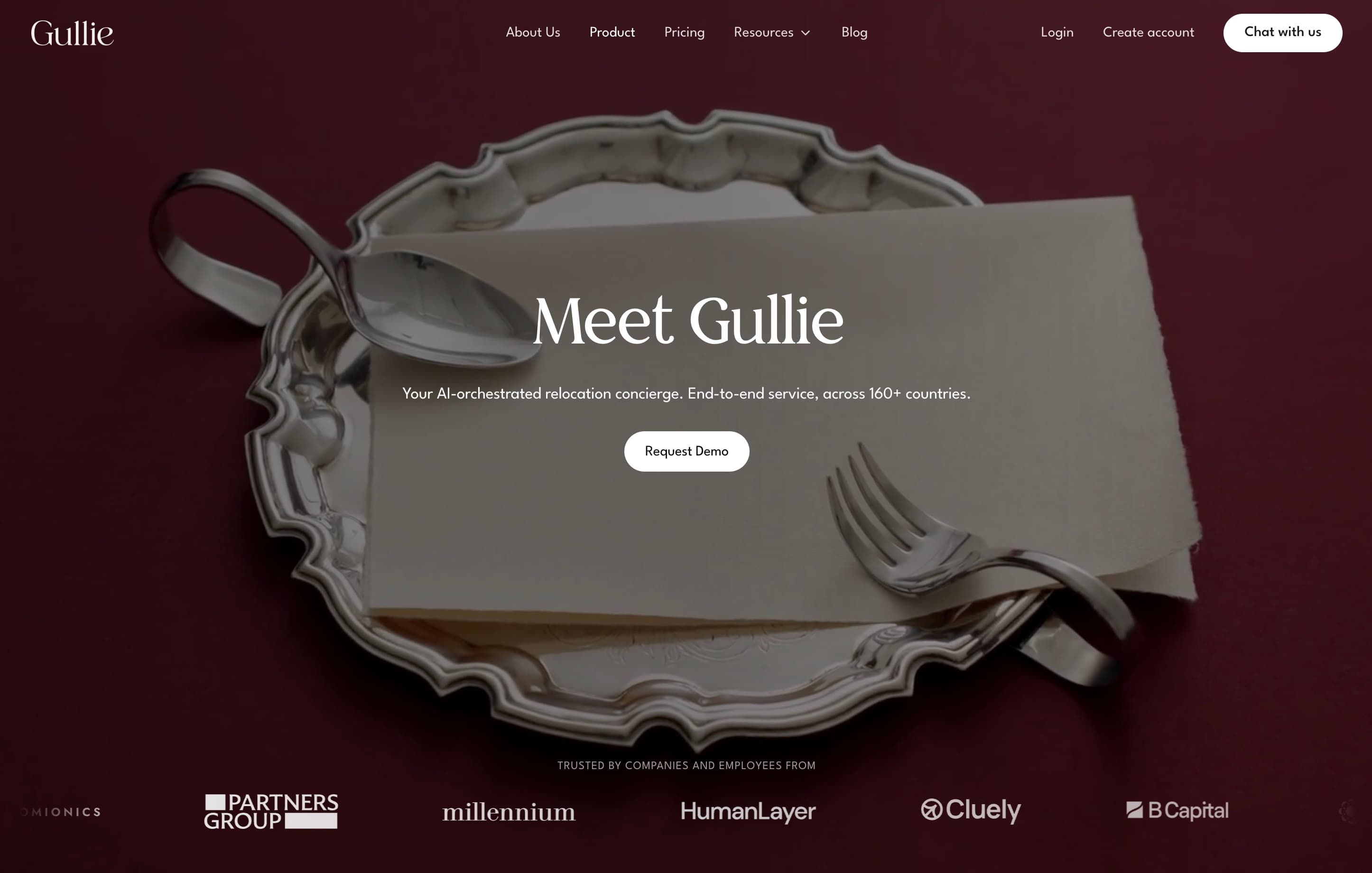
On the 1st of September, we updated our brand identity across our website, product & more. The orange is retired. In its place is a deep bordeaux, ivory, serif headings, custom monogram, and a hand-drawn bell-boy mascot.
I wanted to share the process behind designing this new identity, because as much as we are an AI-native firm, our belief is:
Relocation is a people business, and we are in the business of hospitality.
Our foundation: the team behind Gullie
To understand the brand, you need to understand the people behind it.
Gullie was born from my personal frustration of having to move 12+ times without great support. The world class team supporting me mix of third-culture kids, expats, and serial relocaters who understand what it costs to uproot your life and rebuild yourself many times over.
Amongst us, we speak English, Chinese, Russian, French, Bahasa, Korean and Spanish fluently, and have lived in over 10 major cities in the world.
The brand name is a nod to Gulliver (from the literature book Gulliver Travels), who (in our brand universe) after a lifetime of travel, returned not as an adventurer but as a guide.
At Gullie, that spirit defines everything: keeping every voyager in a state of ease.
Our Core Values
From the team stemmed from:
our mission
To guide individuals and families through relocation with precision, transparency, and care. Every detail handled well so the move simply disappears, & life begins.
& our values
- Mastery & Wisdom
- Graciousness & Care
- Discretion & Trust
- Presence & Belonging
With AI, much of the busywork behind the scenes can be automated, allowing us make great relocation support more accessible to the mass market.
Relocation is a luxury product
Relocation is a premium service. It was designed for the top talent in the world and the companies that move them.
So before we opened Figma, we spent a few weeks arguing about one question: What should it feel like to be moved by Gullie?
To us, luxury is being known so well, you have no decisions left to make.
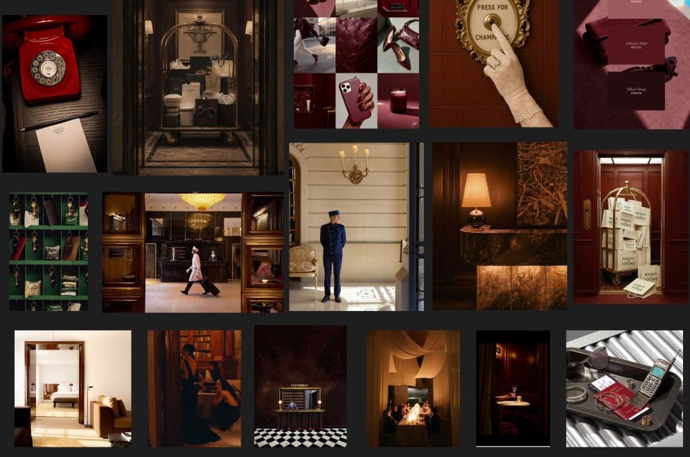
Think about some of the most luxurious hotels: Claridges, Badrutt’s Palace & The Ritz Paris.
Everything’s been taken care of before you’ve even shown up. With AI or not, they’ve fought the devils in the details, and tailored your experience based on your preferences.
All you have to do is arrive in an environment that calms, and puts you at ease.
Moving somewhere new is one of the most significant decisions a person can make, and our job is to make it feel effortless. Like the best concierges in the world, we anticipate what’s needed before it’s asked. Every product decision reflects that standard.
Being two steps ahead
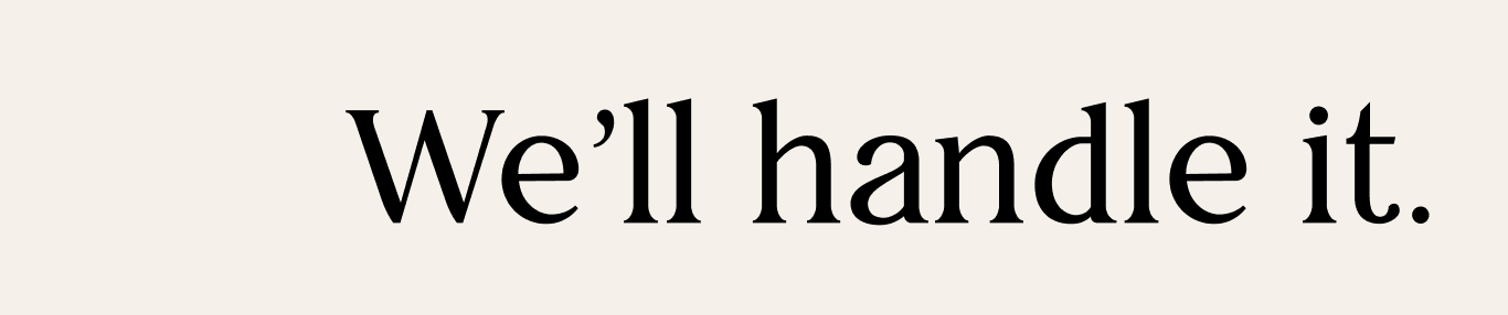
Our tagline is the memorable phrase we want people to connect with our brand. It appears across various touchpoints to inspire and engage our audience.
The relocation industry is archaic.
Movers & service apartment companies still coordinate bookings, with threads often times running over 100 emails per case.
Getting one person from Bangalore to Berlin means going back and forth with a dozen suppliers who do not talk to each other. Somebody has to do that chasing. We decided it should be us.
Doing it well means being two steps ahead.
If you have run enough moves you know where they break: the lease that needs a local guarantor, the container that sits in customs over a public holiday, the school place that closes a month before term. We know these before you do, so most of the time the problem is handled before it would have reached you.
Gullie’s mascot: a bellboy
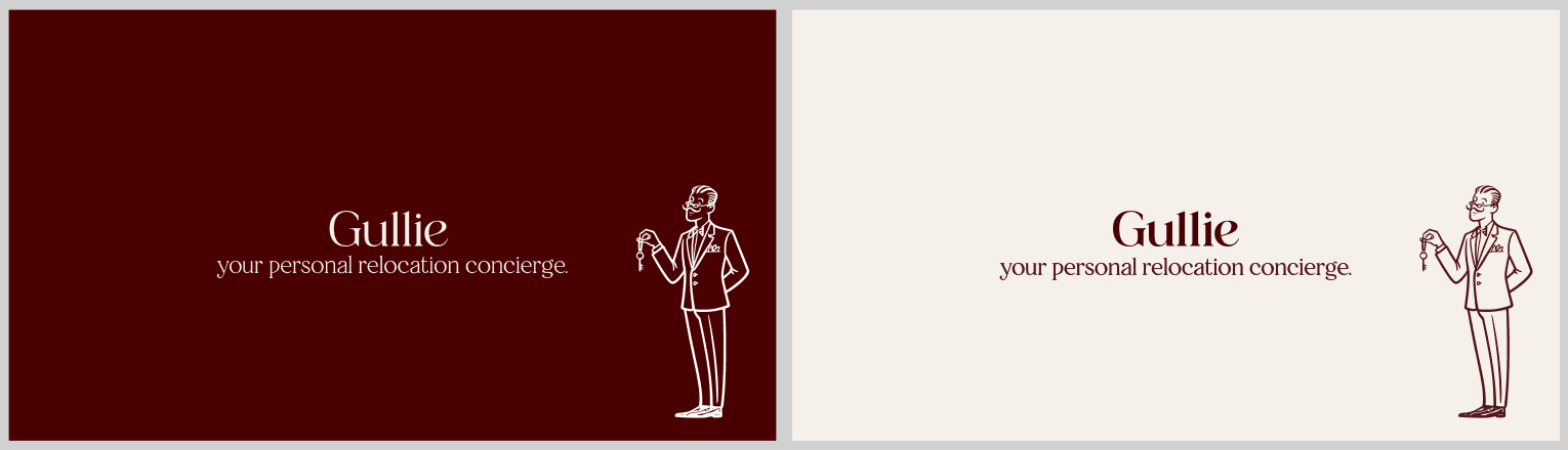
To represent the concierge, we hand-drew a line illustration of a man in a suit holding up a ring of keys.
Our monogram
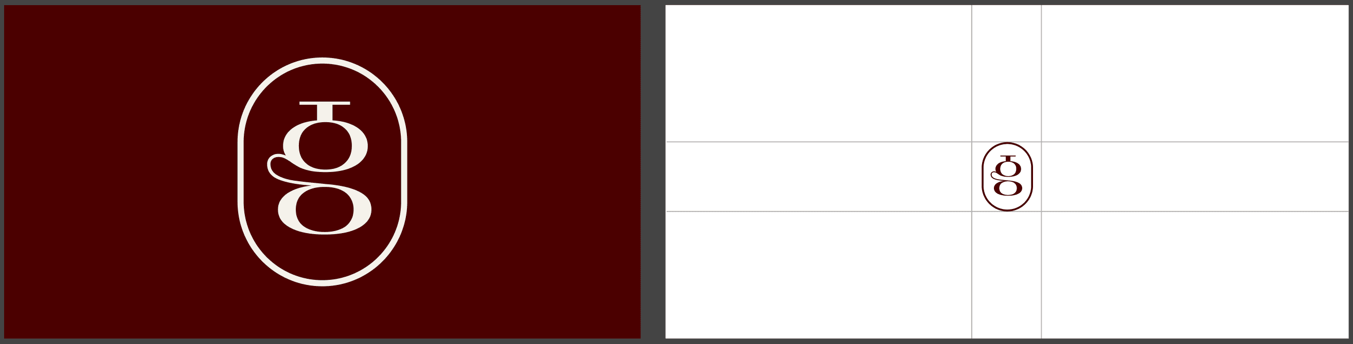
The Gullie mark is understated, hand-drawn logo inspired by the bell at the concierge desk, weaved into the letter G.
Aftercare
Our job isn’t done the moment you’ve arrived.
Once you’ve landed in a city, we manage the aftercare too. We ensure you’re well oriented in the neighbourhood, the doctor, gym, and integrated into a community of people you want to have dinner with.
Beyond Gullie
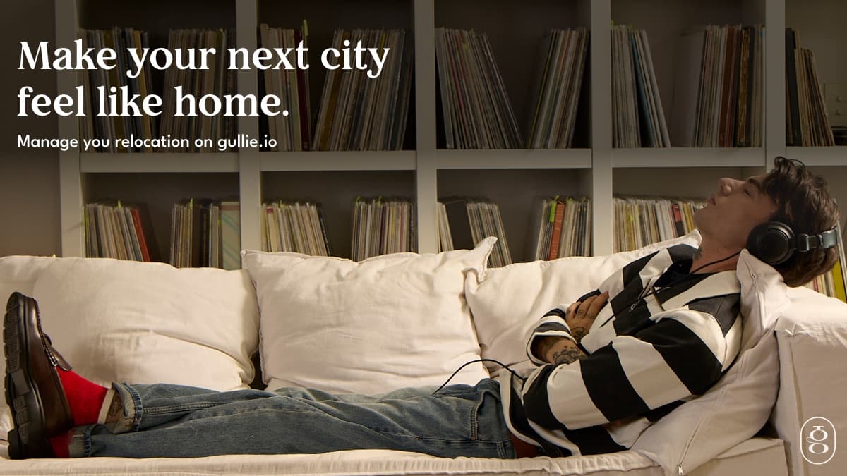
All of this work is for one outcome — so your next city feels like home.
This is just the beginning, we can’t wait to show you what's next.
Check us out here.